
Category: Masterframe
COLOUR – MOOD AND YOUR DÉCOR
The colours that you choose to surround yourself with in your home reflect your unique personality and style but even though we might not realise it, the colours around us influence our moods and emotions that can take us from tranquillity through to anger.
Although colour will affect people differently dependent on factors such as age, gender, and climate etc., some colours or range of colours appear to get a similar reaction. It is important to choose colours wisely to create tranquillity and harmony in your home where you need it and to match colours to rooms for the desired effect.
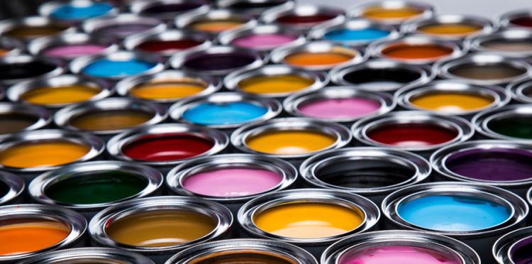
Here are just a few colours and their possible effects:
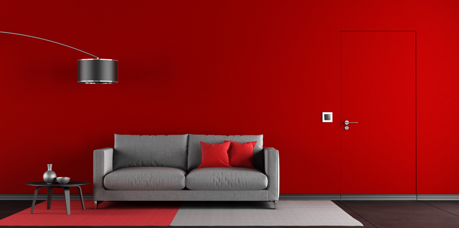
Red:
The most intense colour infuses the room with energy and makes a visual statement. It would work well in a dining room where the atmosphere is animated and social. Red has been known to elevate blood pressure and speed up the heart rate. For this reason its best kept for rooms that you use after dark in muted lamp light which transforms its appearance and enhances its elegance.
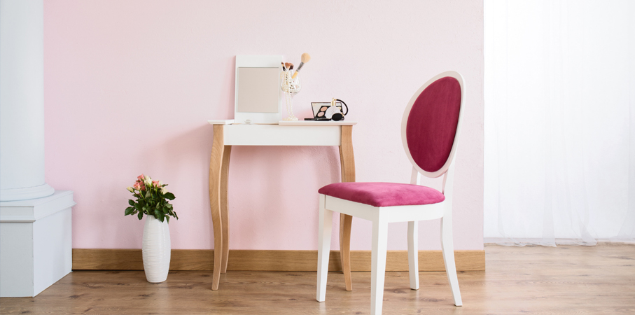
Pink:
Pink can have a calming effect on the nerves and helps to relieve anger. In contrast to red, it is said that the longer you are exposed to pink, the calmer you will become.
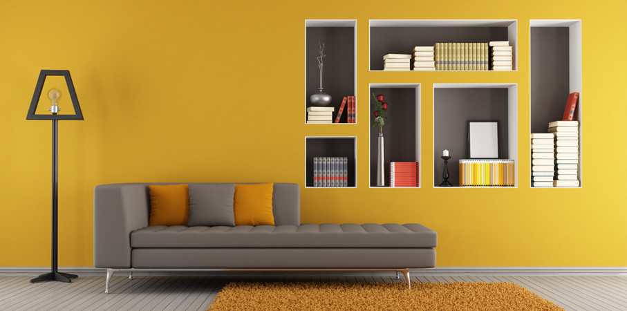
Yellow:
Yellow is a joyous colour that signifies happiness and energy. It is a great colour to use in entrance halls and small areas where it is welcoming and cheerful but it is not necessarily a good colour for the main scheme. In expansive amounts yellow can create feelings of anger and frustration.
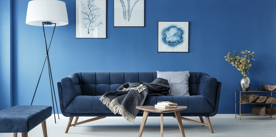
Blue:
In contrast to red, blue is believed to reduce blood pressure and heart rate and therefore has a calming and relaxing effect suitable for bedrooms and bathrooms. Although blue rooms are lovely for relaxation, pastel blues can have a very cold and chilly effect. Warmer blues will work better in areas where relaxation is key but when used as a main colour, softer shades work best. Dark blue on the other hand can bring on feelings of sadness so perhaps not suitable for a main colour scheme.
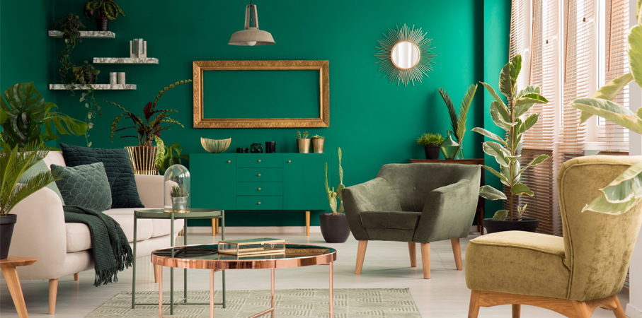
Green:
Considered the most restful colour on the eye being refreshing and cheerful, green is suitable for use throughout the home. In family rooms it will help with relaxation but will also exude warmth for a feeling of comfort and cosiness. Used as a main decorating colour it is known to relieve stress and encourage relaxation and would be great for a home office as it symbolises prosperity.
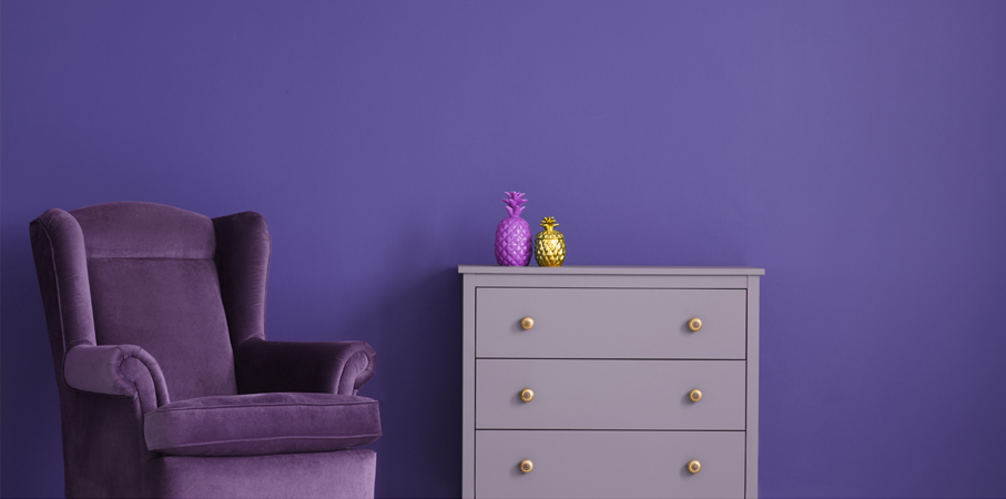
Purple:
Rich and dramatic, purple is good to use as a secondary colour for its association with royalty, luxury and creativity. Lighter shades such as lavender have a restful quality suitable for bedrooms.
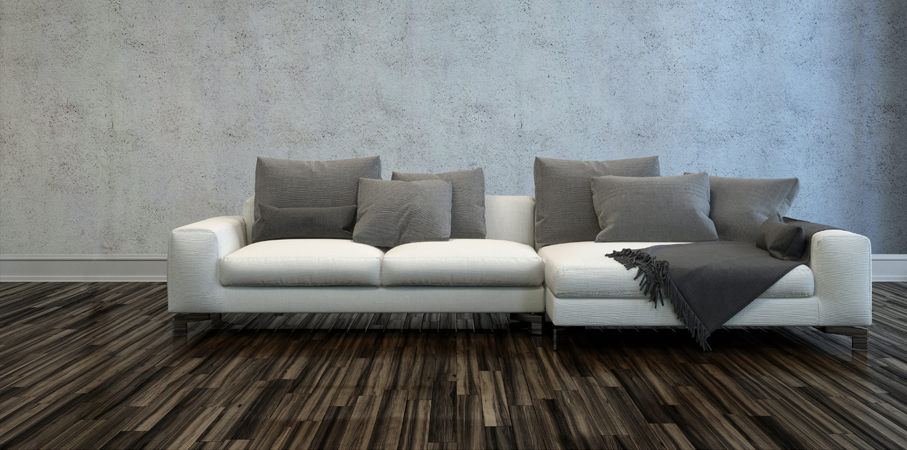
The Neutrals:
Black, white, grey and brown are the basic colours and the all-neutral scheme comes and goes out of vogue. The neutrals can be used together with other splashes of colour to calm or lift the scheme.
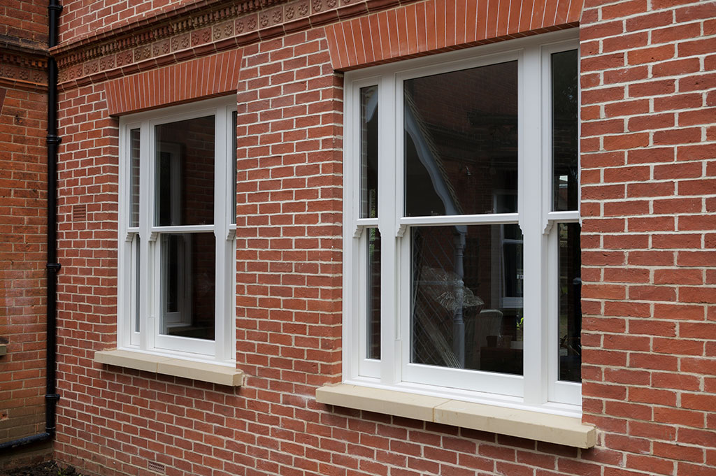
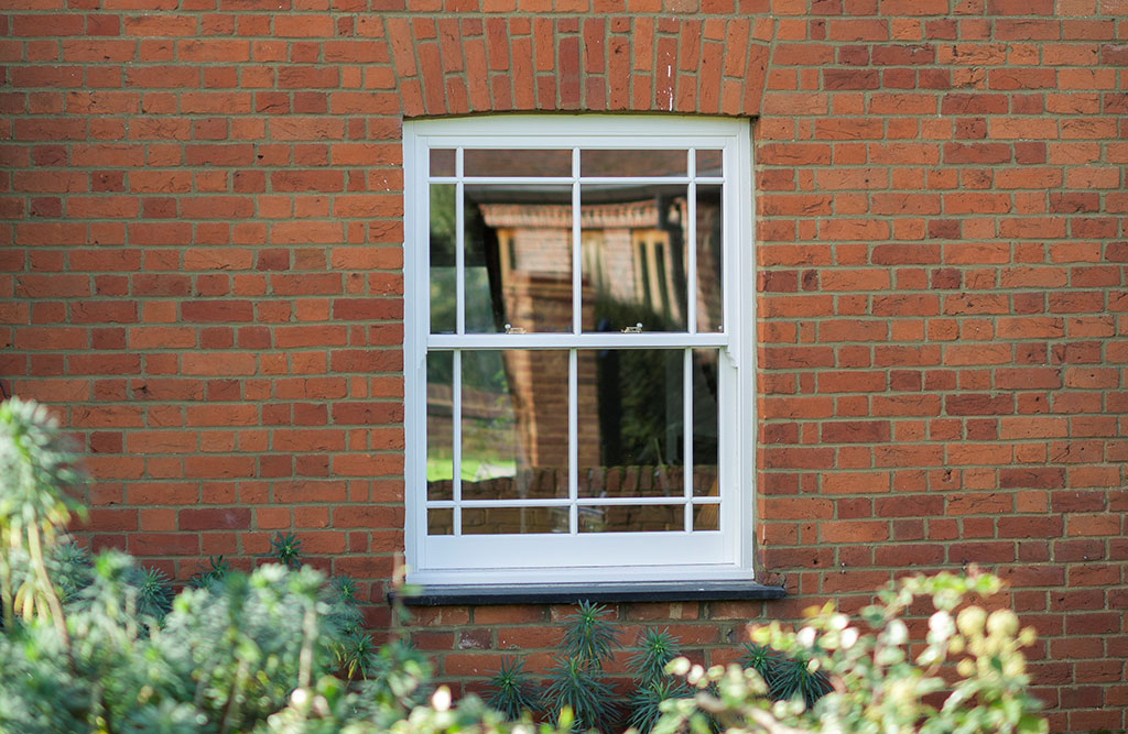
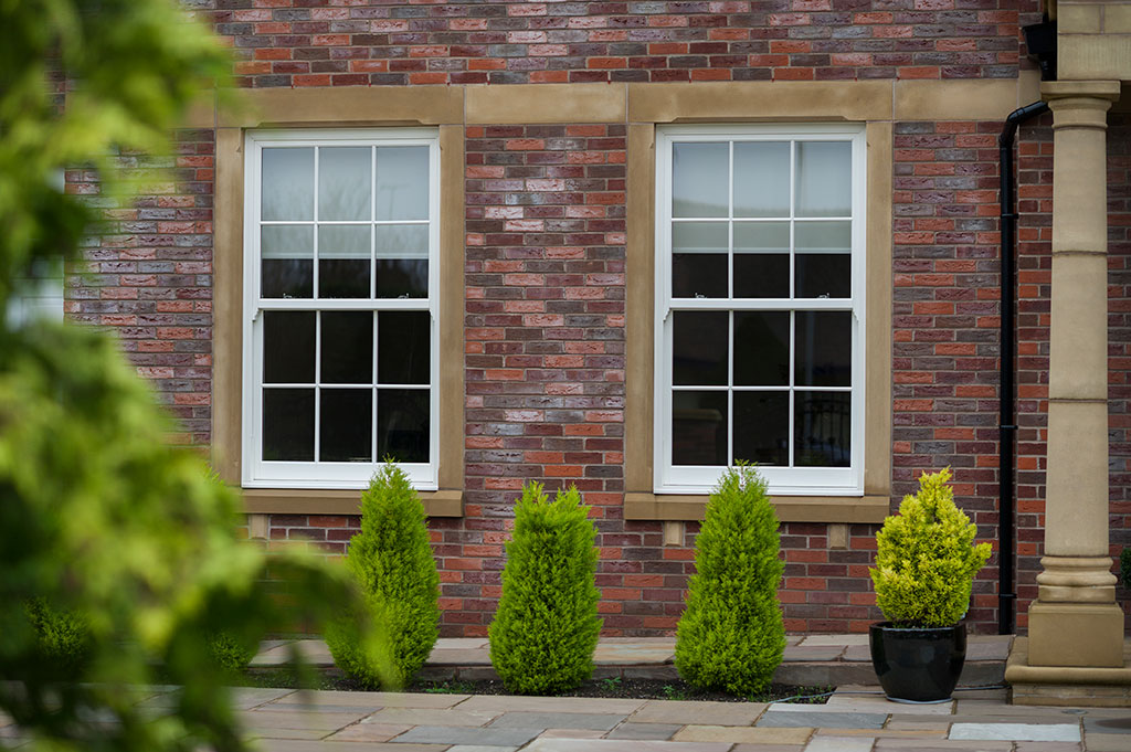
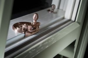
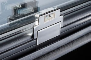
Sash windows to match:
Whatever colour you choose to put an individual stamp on your décor, when you invest in Bygone Collection sash windows you will automatically be adding a touch of luxury to your home. The windows are beautifully crafted with a wide range of stunning features that suit either a traditional or contemporary styled home.
You will also be able to choose the colour of your new sash windows to match any leading brand paint supplier palette so your décor can carry your personal touch right through to the colour of your windows. To help you to find your perfect colour match why not visit our brand new colour configurator here which will make choosing your special colour that much easier.
To find out all your options contact your nearest Bygone Master Installer or download our brochure for some instant inspiration.