

Category: Masterframe
COLOUR EXPERTS CHOOSE THEIR COLOURS FOR 2020
 It’s a new decade and both Pantone and Dulux have chosen their colours of the year for 2020 and they couldn’t be more different.Dulux have chosen Tranquil Dawn, a colour that is somewhere between green, grey and blue and Marianne Shillingford, Creative Director for Dulux UK says “’A new decade heralds a new dawn and the hazy pale green tones of Tranquil Dawn are calming and comforting just when we need it most in our lives”
Dulux goes on to say “Tranquil Dawn “embodies the nation’s mood on the approach of a new decade. It reflects a growing desire to understand what it is to be human at a time when advances in technology are making us feel increasingly disconnected from each other,”
The versatile colour appears to change according to the tones it is used with and can work in neutral, soft, bright or warm palettes.
Across the pond, the Pantone Color Institute has chosen Classic Blue, a deep indigo blue shade.

Laurie Pressman, Vice President of the Pantone Color Institute, tells TIME. “It’s a reassuring blue, full of calm and confidence. It builds connection.”
Pressman said that Pantone felt that the colour highlighted dependability, trustworthiness, credibility, and constancy, all traits that are valued in the fast-paced, high-stress situations of the current world. She also pointed out that the deep blue matches that of the sky at dusk, which highlights our desire for this dependable, anchoring foundation on which to build as we cross the threshold into a new era. We’re living in a time that requires trust and faith and confidence.
“We’re returning to classics because everything has been chaotic in the world,” Pressman said. “It’s not about doing it like you did in the past, but reinterpreting it.”


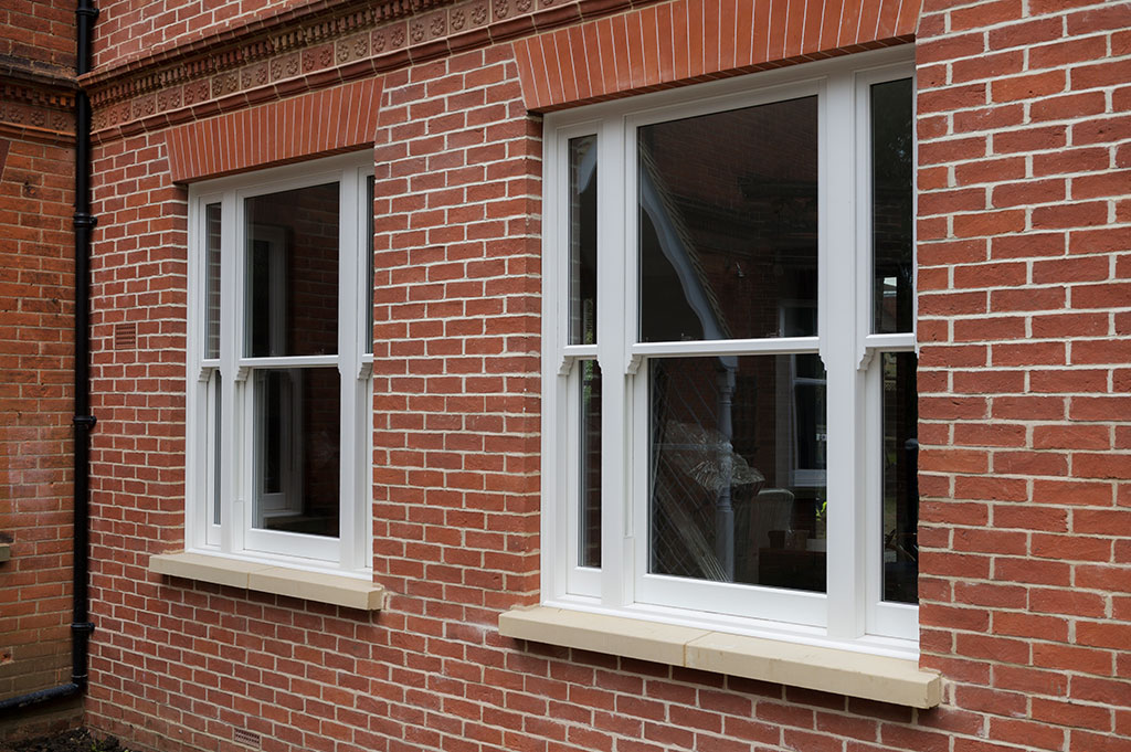
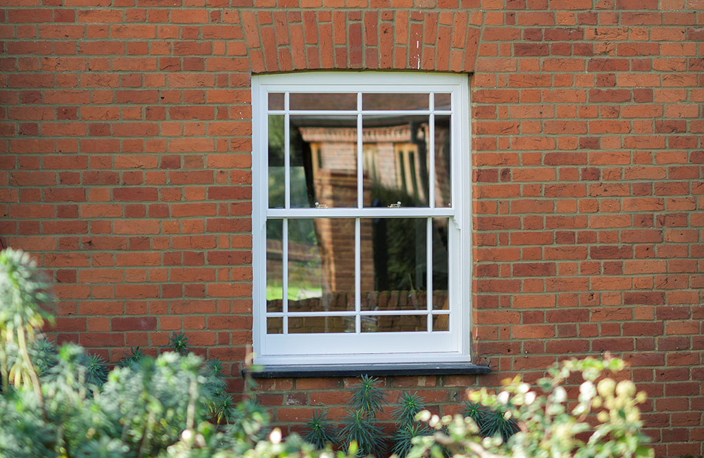
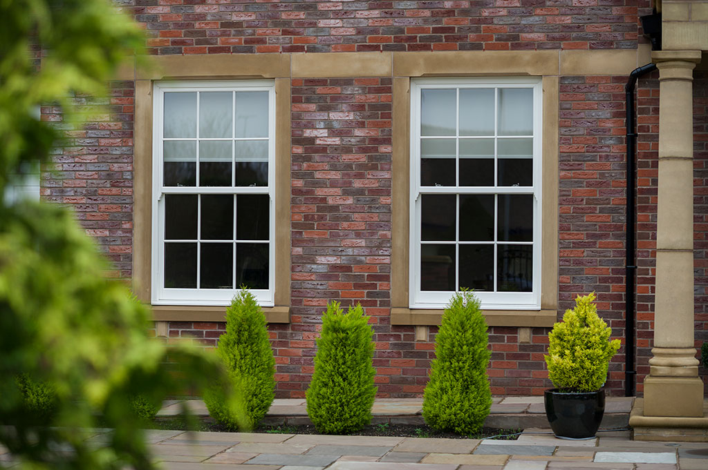
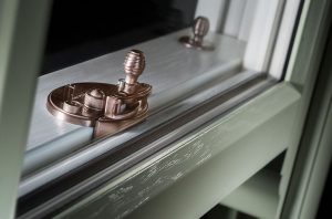
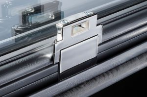
Carol Slade, Managing Director of Masterframe, manufacturers of the Bygone Collection says “Colour is a growing trend in windows right now with more adventurous choices passing through our factory on a weekly basis. It seems that our customers are using their windows as an extension of their décor theme and making a statement.
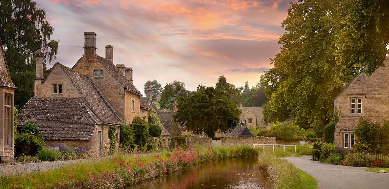
Both colours are interesting choices and if you are using them as a wall colour then our Bygone Collection white wood foiled sash windows will create a striking contrast with the Classic Blue or a softer more natural effect against the green tones of Tranquil Dawn.
Alternatively, if you wish to carry your décor theme through to your sash windows then again Classic Blue windows would be stunning and elegant whilst Tranquil Dawn windows would be soft and neutral. If these two colours are not to your taste, we can match to any leading brand paint supplier colours”.
For more information on the Bygone Collection, download the brochure here.