
Category: Masterframe
PANTONE COLOUR OF THE YEAR
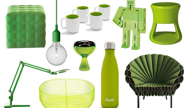
The 2017 colour of the year expresses vitality and connects us to nature and spirituality, symbolising our desire to separate ourselves from the turbulence of modern life. The colour is a yellow-green shade, zesty and warm and reminds us of the first flourish of spring when nature is once more awakened, revitalised from a cold winter.
Leatrice Eiseman, Executive Director of the Pantone Colour Institute explains that “While Rose Quarts and Serenity, Pantone’s Colour of the Year 2016 expressed the need for harmony in a chaotic world, Pantone 15-0343 Greenery bursts forth in 2017 to provide us with the reassurance we yearn for amid a tumultuous social and political environment, satisfying our growing desire to rejuvenate and revitalise. Greenery symbolises the reconnection we seek with nature, one another and a larger purpose”.
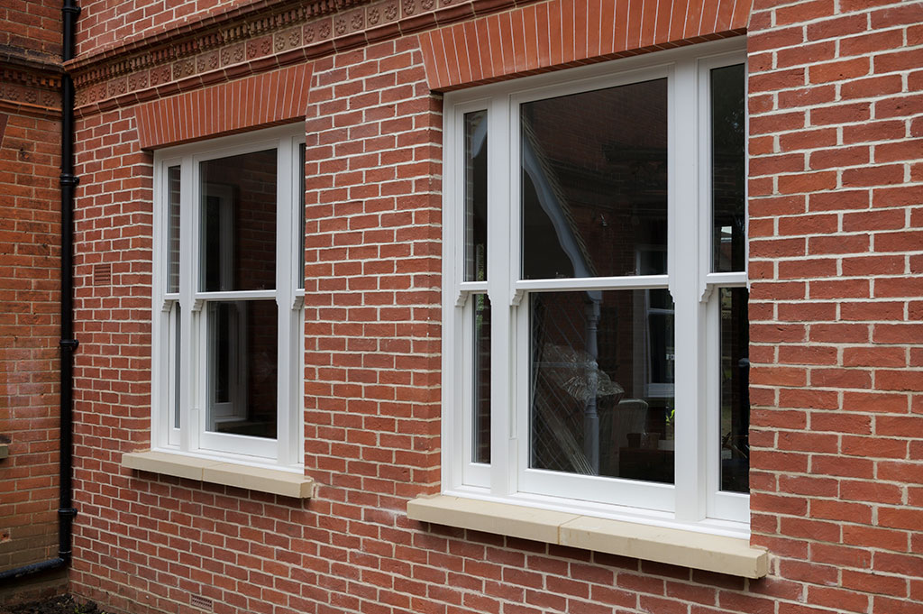
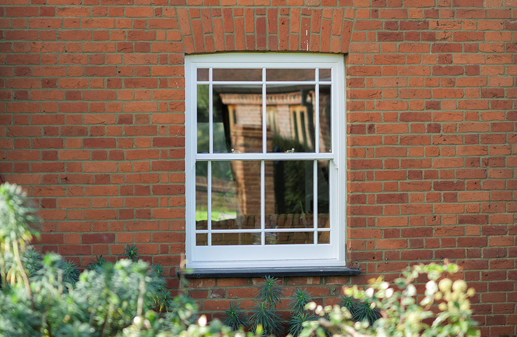
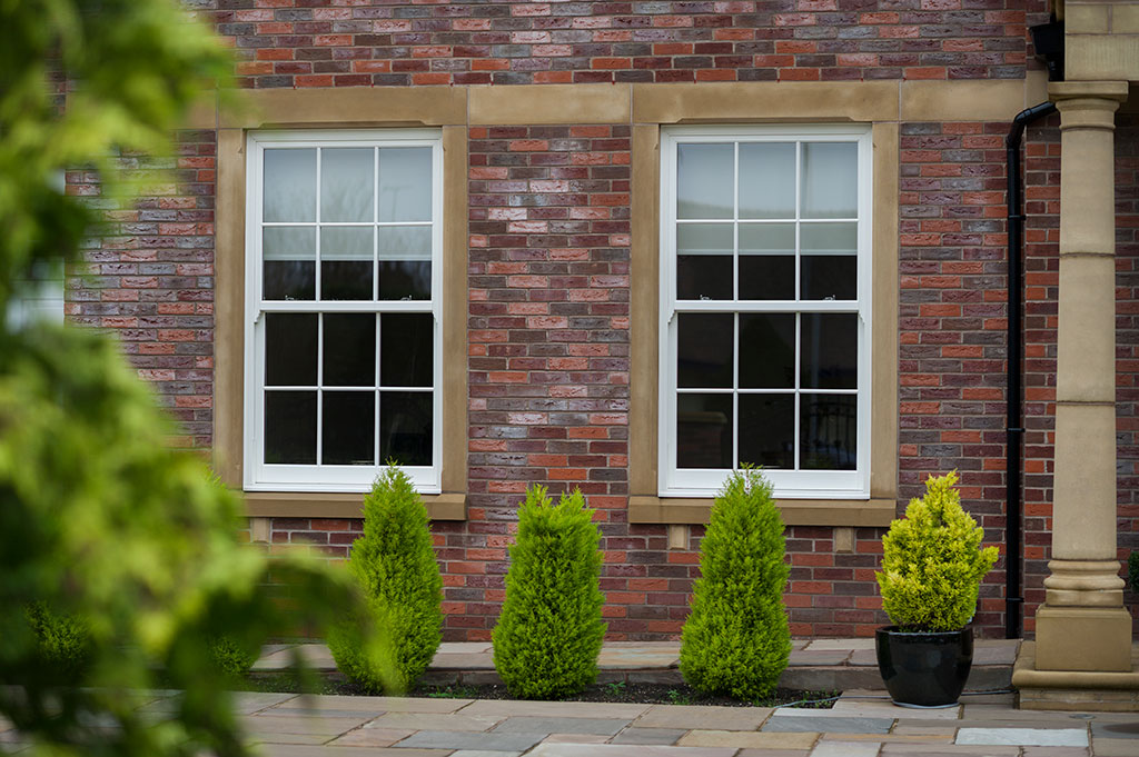
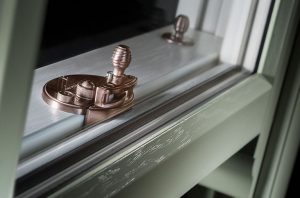
If you wish to follow the trend towards including all things authentic in your life, then the Bygone Collection of windows is the perfect choice. Each minute detail has been lovingly crafted and then integrated into the design to produce a quality sash window that pays homage to the original timber box sash windows of old.


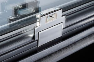
Pantone Greenery is a versatile shade that can be used with many different colour combinations and although white would create a fresh look alongside the green, you might want to be more adventurous and use a complementary shade on your new sash windows. If that is the case then we can colour match to the shade of your choice to create your unique combination.
For more inspiration, download our brochure here.